Mizaru
Case Study
An online matching platform that connects Deaf and DeafBlind people with on-demand freelance service providers to empower them with accessible communication services.
Role
UX/UI Designer
Duration
1 month
Device
Desktop, laptop, & iPad

Overview
Problem
Over 85 million people in the world are either deaf, deafblind, or hard-of-hearing. Without access to communication, living independently is incredibly challenging. Mizaru needs a complete new website layout, to connect the right providers to deaf or deaf-blind clients in order to help them with accessible communication services.
Solution
Design a website where users can easily access their dashboards, accept or deny a request, access their profile and account settings.
My Role
My role was to create high-fidelity designs of a new website, supported by research, which includes the provider's dashboard, requests page, profile and account screens.
Research


User Flow
This user flow demonstrates how a provider would sign up and login to their account.
-
After signing up, the provider must wait to get approved by Mizaru.
-
After getting approved, provider must complete a questionnaire.
-
Then, provider can continue to dashboard and access the following:
-
Profile
-
Requests:
-
accept requests
-
deny requests
-
completed requests
-
-

Goals
Stakeholder's Goal:
-
Create a questionnaire for first time users.
-
Create a new dashboard, with a requests page, a profile page, and an account details page for both clients and providers.
-
Remove chats, calendars, maps, and payment options from the new design.
Design Team:
Our design team, Lucy Li and I, worked on two separate flows to achieve the stakeholder's goal. My teammate Lucy Li focused on the client's web layout, while I focused on the provider's web layout.
Current Screens
-
Incomplete
-
Not organized
-
Needs rearrangement & redesigning for accessibility


Design
Sketches
Dashboard

Account

Assignments

Contact Us

Profile

Log out

High Fidelity Screens
After discussing all the goals with the stakeholder and creating sketches, I went ahead and created high fidelity screens to reflect the new changes.
Old Dashboard

The navigation bar is very small and on top of the screen.
The original dashboard included a calendar and it showed the "accepted" and "completed" assignments right above it.
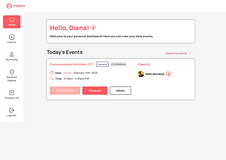
New Dashboard

The new dashboard has a welcome message with a description card that displays the providers daily events, if any.
The navigation bar was made bigger and moved to the left side of the screen with icons, for easier access and better understanding.

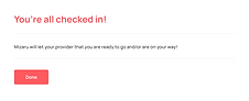
This screen shows that the provider has an event that day and can "check-in" 30 minutes before the event time.
When I first designed my screens, I had "Events" labelled as "Assignments" which the original designs had. But after presenting my designs to the stakeholder, they requested that I change "Assignments" to "Events" as shown below:
Before

After

Old "Assignments" Page

The assignments page included the open assignments, but did not display the cancelled assignments or completed assignments.
New "Assignments" Page

The new assignments page, shows the provider their new requests, active events, cancelled events, and complete
Old Profile Page

Too many clicks (time consuming)
"Contact us" and "Logout" shouldn't be nested under this profile side panel.
New Profile Page

Separate sections to include the provider's:
-
Personal Information
-
Health & Mobility
-
Service Animal
-
Communication Preference
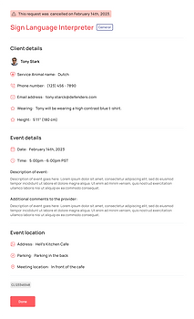
This information will be displayed to the clients when they click to view the provider's profile.
Looks more organized and is easier to navigate.
Since the stakeholder did not have a separate page for account settings, that is something we included in the new design. Clients do not need to see the provider's personal information, such as their home address, email address, date of birth, or payment information, therefore creating a separate screen for this information was necessary.
New "Account Details" Page
Separate sections for personal information and provider's emergency contact.
New section was added with the options to change password and turn on two-factor authentication, if necessary.

Option to delete account.
Provider can access the code of conduct and privacy policy at anytime.
Providers can easily access their payment settings in this section.
Old "Contact us" Page

"Contact us" is nested under the profile side panel.
Not designed for accessibility.
New "Contact us" Page

Designed for accessibility:
-
No more dropdown list
-
Checkbox list best for screenreader
-
Organized and easy to navigate

New Requests
Providers can easily access all their new requests.
Active Events
Providers can easily access all their active events.


Cancelled Events
Providers can easily access their cancelled events.
Completed Events
Providers can rate all their completed events to help encourage improvement!

Final Prototype
If I had more time:
-
I would conduct usability tests to improve my designs and fix any mistakes (the stakeholder did not want us to conduct usability tests and only wanted us to focus on the high-fidelity prototypes).
-
I would create more wireframes to demonstrate how to create an account with Mizaru.
-
I would create wireframes to demonstrate how to make a payment on the platform.
-
I would create the mobile (app) version of the provider's dashboard and profile screens.
What I learned:
-
To efficiently communicate project goals and deadlines with stakeholders and teammates.
-
Make sure everyone is on the same page and there are no confusions.
One of the challenges I faced was communication and alignment around project goals and timelines. There was some miscommunication in the beginning of the project with the stakeholders regarding the project goals and tasks, which made this experience a bit challenging.
To overcome this challenge, my teammate and I established realistic goals and objectives for the project, and discussed this with the stakeholders. We managed to get on the same page as the stakeholders and regularly checked in as a team to ensure that our work was aligned with those goals and discussed any challenges and brainstormed solutions together. We also created a shared understanding of the user needs and pain points we were trying to address and used this as a framework for our design decisions. This not only helped us stay aligned as a team but also created a sense of trust and mutual support.
One thing I learned from this experience is the importance of active listening and empathy when collaborating with others. By taking the time to understand and appreciate different perspectives, we were able to work more effectively as a team and ultimately create a better product.
Overall, I believe that collaboration and teamwork are essential to successful UX design, and I am committed to continuing to learn and grow in these areas.
Final Screens
First-Time Questionnaire


Login/Logout


Dashboard


Events/Requests


Overlays


Profile/Account/Contact Us


